What web designers can learn from the fashion industry
Buying clothes online is a risky venture, since much of shopping is knowing how the apparel feels and fits your body. One of the best ways to persuade people to buy clothes online is by being very meticulous. That’s why fashion industry websites are on top of the game when it comes to reaching their target audience, as well as call-to-action responses.
If you want to engage visitors on your website and persuade them to follow a particular course of action, then the fashion industry has much to teach you.
Trends in web design, like that of fashion, come and go. For years, it struggled to get consumers interested in buying clothes online. After years of constant attention to detail, and an intimate understanding of the audience, that fashion industry made it work. Now, here are some lessons from their success we can learn.
Your home page can be minimalist

As designers, we all know that a minimalist design can achieve beautiful results. Still, many designers have trouble creating one. In fashion, it’s all about the look, and the industry certainly knows how to bring a product front and centre. One method of doing so is through the bold use of full-screen photography with little to no copy. If you hide the navigation under a hamburger menu, for example, it gives the hero image maximum exposure and shows real confidence in the product.
Microcopy can move mountains

Microcopy isn’t exactly a new concept. It’s always been there in our websites. Yet, only recently have marketing analysts begun to understand how much it matters, as well as how much it affects the quality and effectiveness of your web content. The fashion industry knows that microcopy guides your website visitors and encourages them to stick around.
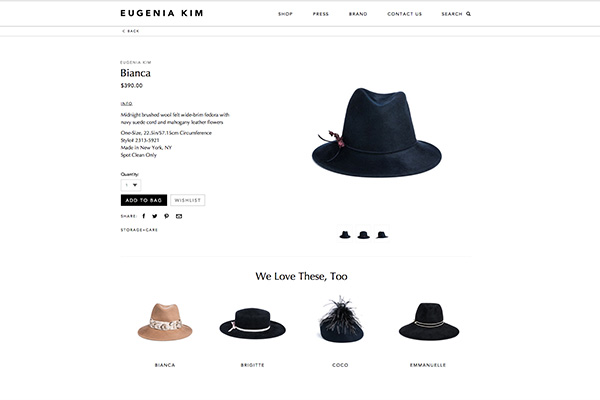
In fact, research conducted by Kiss Metrics found that the number one reason a web visitor will leave your website before advancing further is poor navigation. This means that potential customers won’t continue through the ideal website progression if they can’t find what they want quickly. Another example is where a website swapped the tired phrase “Customers also bought…” for “We love these, too”. This created a much more personal and engaging note.
Personalize the user experience

Personalization is far more than simply offering a welcoming experience. It’s centred on customizing the user’s experience on your website according to his or her own tastes, preferences and interests. By putting your customers’ needs and wants first, they’ll understand that your brand cares about them as individuals. Personalization also helps replicate the human to human interaction customers enjoy when buying offline. When you provide a personalized experience, visitors remain on your website longer, download more offers, and ultimately purchase more products.
Newsletters are in

This is a great way to have your audience keep up-to-date with the latest trends, happenings, and products. You might have thought e-newsletters died off in the ’90s, but many retailers have taken to broadcasting the fact that they’re offering newsletters by tying signing up with promotions. The fashion industry is leading this charge, even offering gender targeted newsletters – with a ‘pass’ option if you don’t want to reveal your gender. Almost every online fashion retailer offers them, and they’re a great way to facilitate consumer engagement.
Live chat as an option

Most people make the assumption that live chat will work in all conditions. You get to talk to your customers so that’s a good thing, right? Wrong. Fashion is a personal and intimate business, so it’s not surprising that the industry is taking full advantage of new live chat technologies. But nobody wants a grinning drone in headphones staring at you from the website. An example of how to present this feature subtly would be in a sleek Contact Us tab at the bottom of the webpage
Make decisions for the user
Shifting the orientation toward decision simplicity and helping consumers confidently complete the purchase journey is a profound change. It requires marketers to flex new muscles and rethink how they craft their communications. In the words of web visionary Seth Godin, “Don’t make me think”. Endless choice and constant decision making is tiring, and so many fashion websites offer to help make choices for you. To help consumers evaluate choices, most brands describe their different features and benefits. Some go a step further, offering buying guides containing side-by-side brand or product comparisons.
As you’ve read from above, it’s only through constant attention to detail, and a true understanding of your audience, that we can improve our web designs.

